This year we are expected to create a website for our artist. It is very important to every artist as as it one of the most easiest and convenient ways to communicate with audiences and promote themselves and their product.
Here, I am going to look on to different artist's websites, compare them and see what do they have in common and what is different.
The first artist I chose is Ariana Grande.
This is her website. She is an American singer and perfomes in pop and R&B genres. She is 23, however she is already very well known.
When going to the website, it opens with a homepage, but there are many others categories.
The homepage shows the main information, introduces the artist and make the further exploration of the website easier.
Due to the recent events in Manchester, the first thing that the viewer will see on her website is this:
This shows that she worries about people and represents Ariana as a sensitive and caring artist.
Scrolling down, it also shows the dates of closest concerts with links to buy tickets for it.
This promotes her concerts and therefore attract more people to it.
We can also see a first picture of her so far. It is close up, but there is no eye contact. The main idea is probably just to shoe her and create more empathy.
It also shows the latest news and even allow to listen to some of her songs.
This keeps her fans up-to-date and even more promotes her songs.
The homepage also promotes tour merch with links to actual products.
The last thing on the homepage is links to all her social media and also a form for subscription. This potentially increases her followers and therefore makes more potential customers of her products and concerts.
From the first look the homepage is the most important on the website as it should be easy to use and make the viewer want to find more about the artist. It should not be too complicated or overloaded with information. It has to include access to her main product - music, dates of concerts and show if there are any other products related to the artist. It is also important to have an image of an artist because it keeps link between an artist and audiences.
Ariana Grande mainly targets women and girls and it is clear by the website's design as it is in pink colours. Also, the photos we see are all quite simple and does not use her sexuality to attract men. Also, the news they have on website will be probably more interesting for girls as they are about fashion, woman rights along with concert information.
The website represents her as a very girlish, gentle and cute artist.
Another website I have chosen to look at is
this one. The band Scorpions is opposite to Ariana Grande by genre as they play hard rock and heavy metal. They perform since 1965 and target to elder generation.
The website is made on two languages German and English to target not only their home-region but also other countries.
The website opens with changing advert of upcoming tours.
The homepage divided into different sections, similarly to website of Ariana Grande.
The first section is news, where we can see all new information connected to that band. This make the fans aware about activity of the group. It is next to the photo of leader of the band Klaus Meine. His picture is first as he is better known then other members of the group.
The next section is about upcoming tours. It also have links to buy tickets, so the promotion of the concerts attract more people to it. We can also see a photo of another member of the group so more people are introduced.
There is also a video on the homepage about a tour. The next member is introduced.
Finally, there are some links to different social media to increase their popularity there.
Overall, even that those artists are opposite by genre, appearance and the audience they target, there are many similarities on their websites. For example, they have the same sections like tours, news and photos. This is because they work in the same industries and their fans expect to see those things online. However, smaller details like fonts, colours, design are different as they target different audiences and create different star images. For example, Scorpions are shown more rebellious, the Ariana Grande. Also, Scorpions's website have much more details, when Ariana Grande's in very simple and minimalistic. In my opinion, Ariana's website is more convenient and looks more up-to-date.
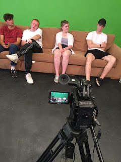
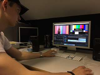
 This week we had a chance to work with cameras again. We went to the studio to understand how video clips are shot. The song was Shape Of You, so most of us already knew the lyrics. We were doing it on 3 different backgrounds: blue walls and a painting, wall with multicoloured lights and greenscreen, one of which gave an experience of working with a track. We were taught to film clapper first and then the singer itself. That is done to easier synchronise sound when editing as you just have to match seconds on the clip and music track. We have done at least three shots of each scene: wide, mid and close as we did when filmed thriller opening title. Every person in our class tried different jobs at it - being cameraman, singer, director. I think that this whole exercise was very interesting and fun.


:format(jpeg):mode_rgb():quality(90)/discogs-images/R-1162337-1459499960-5459.jpeg.jpg)


