Monday 26 September 2016

Posters Analysis

This poster advertises the movie "The Theory Of Everything". Of course it is said clearly in the biggest font. On the poster we see the main characters, which as we see are in love. Because of the title 'The extraordinary story of Jane and Stephen Hawking' we can understand that firstly it is these people, secondly it is biographical movie. The title which says that the story is 'heartbreaking' suggests that it is melodrama. Also we have the names of the main actors, date of the release and names of the company and main team in the bottom. The background (the sky with formulas on it) describes the main character Stephan Hawking as the two main things in his life as we can see are science and his love Jane. Moreover the formulas on the sky link to Hawking's work as it was about space. In the right corner we can see the castle which seems like Oxford. The whole poster looks very mystery, touching and eye-catching so we can predict that the movie will be also like this.
However, I would say that the titles are not clearly seen as they are too small and do not really stand out.
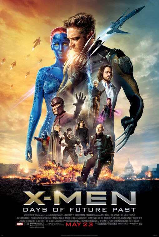
This is a poster of "X-men: Days Of Future Past". Even by a quick looking on the post we can say that it is fantasy. There are main characters which have super-natural powers. The main characters are the biggest and then the less important are smaller. There are also robots and spaceship in the sky which probably suggest enemies. The city in the background is ruined so we may think about war or disaster. The different sky color probably shows different times. This is an action film as on poster everyone is ready for a fight. 
The title is in capital letters so it is 'loud'.
Near the institutional information we can see small Marvel logo. It is well known so even it is very small we can understand it. The date of the release is in the middle, bold and in another color. This makes it really seen and standing out. 
In my opinion the combination of the colors on this poster is very opposite and memorable.

Sunday 25 September 2016

Lesson in Studio #2 (22 of September)

Lately, we had one more lesson in studio. The task was to practice 180° rule. This rule basically means to not cross the axis of 180° for every shot of scene, otherwise the audience may get confused.

After we understood what this rule is about, we have separated on groups to try filming. We decided to keep the scene very simple as we needed just a small practice and we didn't have a lot of time.

We were following instructions we were given last lesson, helping each other.

Our scene: the girl entering the room, checking the time on her phone and the walking away. We have made different shots from different sides, height and different sizes. I think, we have coped well, and now I am looking forward to be taught how to cut it and make the scene looking professional.


Tuesday 20 September 2016

Pleasantville Opening


Recently, we have seen the opening of the movie 'Pleasantville'. Then, we were asked to analyze it.
The first time I was watching it, I was very confused as I couldn't understand what is going on. In fact, the movie starts with different old american TV programs, which are switching around. I think, that may be because someone is bored. The channels are different: sport, news and it always return to the old movie-'Pleasantville'. We can hear very short choppy sound of every program, between these channels there is a static white noise, which in fact shouldn't be there. 
Pleasantville is a classic TV show of 1950-s - vision of an American Dream, so all these programs were about that TV show. The fact that the longest shots are about 'Pleasantville' make us understand that it is the most important.
Then, suddenly, it seems that someone has turned off the TV, so we have got just a black screen. After a few seconds a "Once Upon a Time" appears.
That may give a clue, that this will be a fairy tale-some sort of fantasy.
However, the next shot is very real-looking. 
We can understand that is an American High School because of different stereotypes such as yellow bus and chilled atmosphere of teenagers. We can also spot that it is a warm state as there are mountains on background and everybody wear summer clothes. 


After some shots of crowd and chaotic school court we see the dialog between a girl and a boy:


We have conversation shot reverse shot, the focus is on their faces, so we can't see the background. We can also notice that her face is on the left side and his is on the right. We haven't got any shot of them together, but there is still a strong feeling of conversation between them.
He looks like a school looser and geek.
She looks like a typical popular school girl, probably a cheerleader. However she doesn't ignore him and even smiles, which seems strange.
For all this "conversation" we can hear a music which starts to breakdown when we see that actually they are quite far apart and he just imagines, that he is talking to her. Such a visual joke,

We have here an over a shoulder medium shot. It is quite deep, so we can see that girl who is actually talking to another guy. 


Then, we have even wider shot, which shows us how lonely he is. We should start feel sorry for him.
To make a connection with this character, there is a sound bridge. The shot is wide, he is far but we can steel hear how he is talking to himself.


Sunday 18 September 2016

Analysis of past Hurtwood opening title sequence

Recently, we were asked to watch thrillers from last year. I haven't finished them all, but I really enjoyed looking on this works. The one that I  the most is 'Hidden':
This thriller starts with shots of a very luxurious room. All this scene is very bright, in warm colors, so there is an impression that we are somewhere in the expensive house. I think, all these shots look very professional, especially when the focus is changing. There is also quite a long shot, when focus is changing on the door, which will become important. 
There is a music from the first seconds. As for me, it is not scary or preventing like I would expect in the thriller. 
There are tittles, which are clearly seen, but at the same time not annoying. They are all in white, so they stand out and also they suit the soundtrack.
 When showing the bookshelf, we can see the name of the book 'Hidden', which may give a clue later.

After that, we see a young man, who breaks into the house through the window. The close shot of his foot shows us that he is trying to be silent. This person is searching for something-secret place. Then, we can hear that someone is coming. The man is very scared. To create that feeling, there is no music anymore-just heartbeat.
A person which just came into the room easily finds the hidden in the book. There is a close-shot of the face of a youth-we see his emotions, how he is disappointed.
 The last shot is the name of the movie-'Hidden'. It is white on black background, which makes it very contrast. 

Friday 16 September 2016

The First Lesson In Studio (15 of September)

Отображается файл "image-16-09-16-09-28.jpeg"Yesterday we had a lesson outside our classroom - we were learning how to use camera. Actually, that's was very interesting.

We have learnt how to use tripod and some camera basics. All equipment was professional, so at the beginning I even was a bit scare to use it as I know my luck to break things...

Картинки по запросу tripodFirstly, I have learnt how to bubble the tripod. It wasn't difficult at all, it was more like a game for me (put bubble in the middle of the circle), what is more important-easy to remember how to do it.

Then we took the camera out. We were told how it is fragile and expensive, so I tried to be very accurate with it. We have placed it on a tripod and then were taught how to use it. Now I know, how to focus the camera and expose the shot. After that we learnt about ISO of the camera, shatter angle and white balance. This was already a bit harder for me, but after some time I hope I will do it better and quicker.

 Things to remember for now:

  1. Be careful
  2. ISO for our camera is 400
  3. Its shutter angle should better be 180
  4. The white balance indoor approximately 3000, outdoor 5600 

Thursday 8 September 2016

About Me

Hello, I'm Anastasia and welcome to my blog.
I'm just a simple Russian girl and I've moved to study in England just one year ago.
This is my first year when I'm studying such subject as Media, but I look forward for it. Now, I'm not really into media and I don't know how to do all this Media stuff, but I love to watch different TV-series.
Interesting fact: I have a program, which counts how much of them I've watched, so it says that recent I've spend 2 month 24 days 4 hours on them.
Картинки по запросу supernatural logoКартинки по запросу friendsКартинки по запросу how i met your mother logoКартинки по запросу the big bang theory logo

Картинки по запросу arrow logo png


I'm not really proud of it, but it is the only thing that connects me with media, I guess.
Also, I have a friend and she is a blogger on youtube. We have met in previous school and I've started to help her with her channel. At the beginning, I just was filming with her:

but then, I have started to help her and give some advises and ideas (which actually were working!!!). There is one specific video, which I am proud of because I have put a lot of effort and also was filming it:

Anyway, this year is just starting. I hope I will learn something new (and probably will add a month to my counter..)