Wednesday 29 November 2017

Constructing Website

Here are the screenshots of how Yafei Xiao has started to do our website:


Here are some screenshots of how I started to change our website:


Tuesday 28 November 2017

Constructing Digipak

Here are pictures of how our digipak was constructed by Dora Martynyuk:

 
And this is our first draft of digipak:


Monday 27 November 2017

First Draft of the Music Video

We already started editing our video and here is a performance cut that we have made:

Saturday 25 November 2017

Shooting day: Behind the scene video

Here is a behind the scene video of our shooting day which shows how it went in 1 minute:

Friday 24 November 2017

Evaluation of the shooting day

Yesterday we finally had our shooting day, and in this blog, I will write how was it.
The day before that, we went to the studio to set everything up. We looked at all elements of the 3 elements and decided that the third one is the most complicated in the building, comparing to others. That's why we started with that one as we had more time that day rather than on actual shooting day. For that element, we hanged a white curtain to the ceiling and put a white blanket on the floor. On that day we also checked all our costumes and talked once more with our cast about what do we expect from them.
When I woke up on the next day, I felt quite confident as we were all set up and ready. We started to shoot almost straightaway because the set was ready and actors came at the time. Before the shoot, we just needed to put on Tia nude make-up and the right costume.
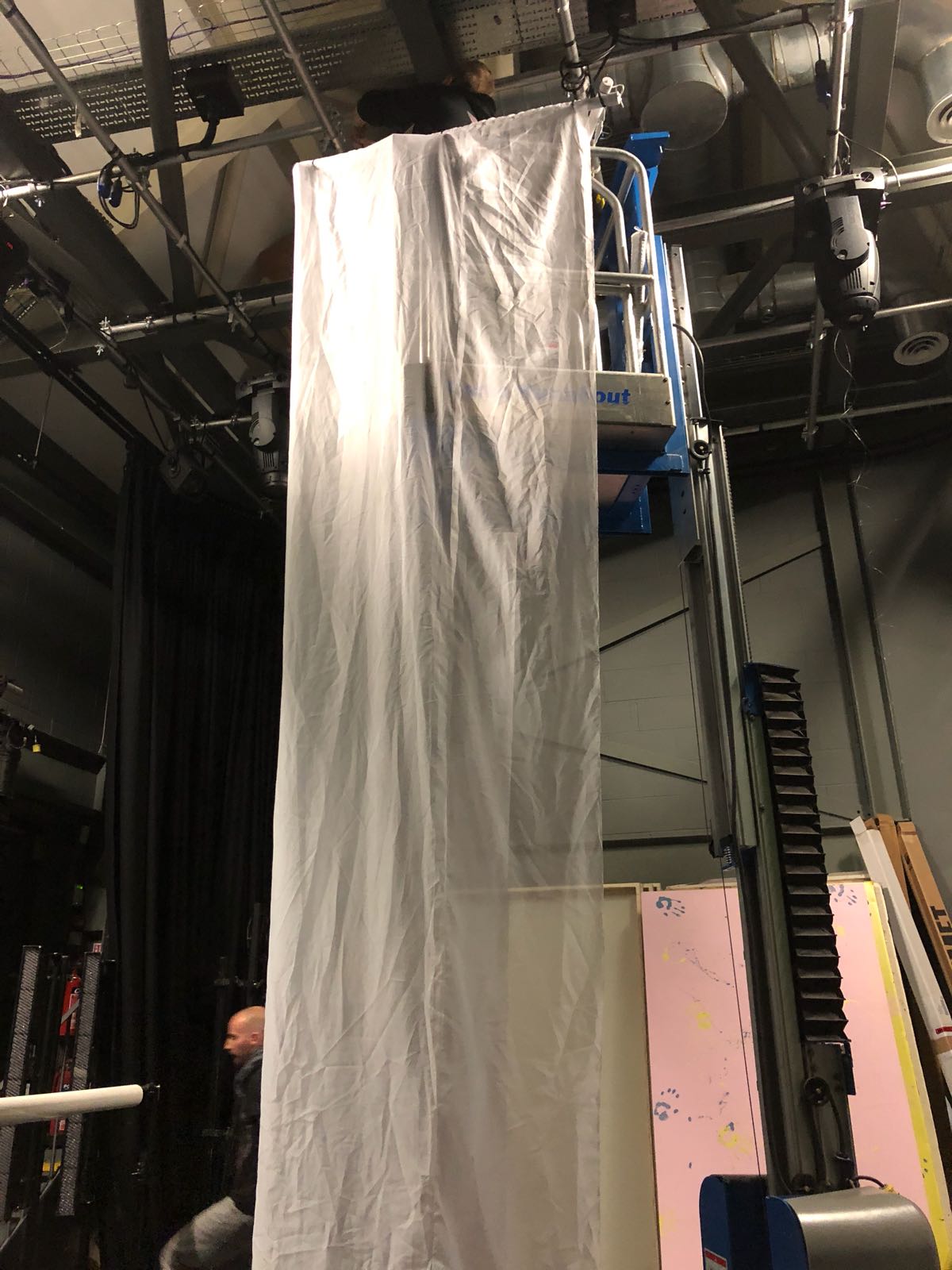
We started shooting with the third element when Tia was inside white curtains. Everything looked very good, how we were expecting it. We did close-up and wide shots of her alone. For this element, my role was to play playback. Then we asked our male actor Max to join her in the curtains. At first, our actors were shy, and we even thought that the element won't work. However, after a few tries, we got several very nice shots that we could definitely later use. For this element, we also did one close-up and one wide shot.
Then we moved on to the first element which is a white background and red couch. Our background was infinity roll which worked perfectly. The couch was also how we were expecting it - in Victorian style. Our artist Tia also changed to a white dress, beige high-hills and put red lipstick on. We also gave her jewellery we wanted her to wear and changed it for all elements as in our research we saw that almost all pop artists have jewellery on. Here, for all poses she had, we shot three type of shots: wide, mid, close. We also did some modelling shots like her dancing or just laying on the couch. In this element, I tried myself as a cameraman and I think I coped well with my job. This element went very smooth and we got very nice shots.
The second set for that element was red background and white couch. The red infinity roll was very nice in colour and we made a final choice for the dress according to it. However, the couch that we had had a hole that didn't look good on the camera. To solve that problem we find a white material and covered one part of a couch with it. Otherwise, everything worked very well and we also shot for each poses three shots: wide, mid and close and then did some model shots. In this scene, I also was a cameraman for many shots as I enjoyed shooting it and it worked for whole my group.

The last element was the dancers surrounded by light bulbs. We left the red infinity roll from the previous element and added light bulbs by hanging them from the ceiling. The dancers were rehearsing dances for all this time so they were pretty ready by the time we needed them. For this element, I was a director so I was just supervising the whole process and giving commands to dancers and the cameraman. This element was harder to shoot as dancers were moving a lot and the red background was not very wide. So we needed to make sure that the borders are not seen in the shot. We shooted three dances for each chorus. For each dance, we also made shots of different width. When we finished with the dancers, we also took some shots of light bulbs.
Overall, our shooting day went quite well and everything went how we were expecting it to go. All the issues we had was easy to solve and it just made that day even more interesting.


Wednesday 8 November 2017

Draft Design of our website

Here is a rough draft of the website I want to create for our artist:

Tuesday 7 November 2017

Research into websites

Previously I already have done a research on the websites, however, now I should explore how the pop-star website is done and what elements it should include.
I was looking at the websites of two pop-stars this time: Taylor Swift and Miley Cyrus.
Here is a homepage of Taylor Swift's website:

It is all made in black and white colours as that's how her new album looks like which is promoted this way. As usual, the main bars are news, events, music and store. You can also easily find links to all her social media which is a cross-promotion of herself. Almost everything is a hyperlink to another page with video/album/photos or some other information about the artist. For merchandise, she has another website where every fan can order it the link to it is also on the main website. Taylor is showed sexy and mysterious at the same time.   

Here is a homepage of Miley Cyrus website:
This website is much more colourful, however, it is also made in the same style as her latest release. We can also see home, events, news, video and shop buttons on the homepage. 
You can also easily subscribe to updates using email and go on any of her social media.
The style of her website is very unique which is catchy for consumers. We cannot see clearly the artist's face on the homepage, however, for that time in Miley's career she probably does not need it as she is very well-known.


Monday 6 November 2017

What is a website?

Why do artists use websites?

  • Good advertisement
  • Free distribution
  • Advertise/sell merchandise
  • Advertise/sell live shows
  • Share/inform content
  • Keep fans/target audience up to date
  • Promote/sell album
  • Helps construct an image
What are the benefits of a website?
  • Free/cheap
  • Large audience
  • Easy access 
  • Direct target to the target audience (social media)
  • Interaction with audience
  • Changeable/updatable - latest info available

Saturday 4 November 2017

Digipak: choices and final decision

Every person in our group made a digipak that they think will suit the best for the debut album of our artist. Here are they:


We discussed all of them and decided to use mine (the third one) as the main idea, but also change it a little bit.
We are going with minimalistic style as it is the same as our music video. The whole album is going to be in white and red colours as it also perfectly matches the music video and also links with the name of the artist-Cheri. So the front and the back of the album is going to be in light, pastel colours, but when you open it will be in deep red colours. I think there is a strong link between the music video and the album cover that we want to make as we want to make audience associate those images with our artist. Also, this style is very familiar to our target audience as it is similar to other pop albums, therefore its sales should be maximised. We can also see how a star image is portrayed in this digipak: on the pictures an ordinary person is shown, however perfect hairstyle and perfect make-up shows that artist is more as an idol for its target audience. The main reason for using technical and symbolic conventions like colors, lightnening, facial expression and others is to show which genre this album is and to attract the right audiences.

Friday 3 November 2017

Digipak: feedback from the group

Today we were pitching our ideas of the album cover to our group. The feedback for my album cover was that the idea overall is good, however, there are still some things that can be changed. The CD part may look too simple and may need more elements to it, but our video itself is minimalistic so this may be a link to our video. All elements work well together, however, it is hard to see a link between all pictures and hands. Maybe it will make sense to show her lips and hands more in the actual video. Also, the CD itself should be changed a little bit. It would probably make more sense to write both: album name and artist's name on the lips.

Thursday 2 November 2017

Digipak my second version

Here is a more detailed sketch of the album cover that I was thinking about. Still, in the front, we will see the artist's close up. The font will be ornate as it suite the best for this genre. I slightly changed the back of the album as thought that it is better to show the artist next to the tracklist rather than write on her. I want to make the front and the back in light, pastel colours, however, the make inside in more passionate, red colours. So on the left inside there will be hands of two people holding each other. This will symbolise a bond, feelings between the artist and man. The background inside will be red. The CD itself going to be white, however, lips on it going to be red too.


Wednesday 1 November 2017

Digipak rough draft

Here is a rough draft of the album cover that I think will be a good representation of our artist. On the front cover, I decided to put her face in close up as it is the first album and we want the audiences to remember her face. Also on the front cover, we are going to have the name of the album "Mon" and her name, Cheri. On the back of the album, I also want to show her as most of the pop-artists attract audiences by their sexuality. On the back, we can also find tracklist, studio names. The picture for the back cover is actually from the third element of our music video. Inside the digipak will be a picture of hers and man's hands on the left. Hands represent the feelings and also link with the dancers and third element in our music video. On the CD itself, I want to write her name and album's name again and use a picture of her lips.