Tuesday, 7 November 2017

Research into websites

Previously I already have done a research on the websites, however, now I should explore how the pop-star website is done and what elements it should include.
I was looking at the websites of two pop-stars this time: Taylor Swift and Miley Cyrus.
Here is a homepage of Taylor Swift's website:

It is all made in black and white colours as that's how her new album looks like which is promoted this way. As usual, the main bars are news, events, music and store. You can also easily find links to all her social media which is a cross-promotion of herself. Almost everything is a hyperlink to another page with video/album/photos or some other information about the artist. For merchandise, she has another website where every fan can order it the link to it is also on the main website. Taylor is showed sexy and mysterious at the same time.   

Here is a homepage of Miley Cyrus website:
This website is much more colourful, however, it is also made in the same style as her latest release. We can also see home, events, news, video and shop buttons on the homepage. 
You can also easily subscribe to updates using email and go on any of her social media.
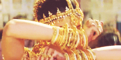
The style of her website is very unique which is catchy for consumers. We cannot see clearly the artist's face on the homepage, however, for that time in Miley's career she probably does not need it as she is very well-known.


Monday, 6 November 2017

What is a website?

Why do artists use websites?

  • Good advertisement
  • Free distribution
  • Advertise/sell merchandise
  • Advertise/sell live shows
  • Share/inform content
  • Keep fans/target audience up to date
  • Promote/sell album
  • Helps construct an image
What are the benefits of a website?
  • Free/cheap
  • Large audience
  • Easy access 
  • Direct target to the target audience (social media)
  • Interaction with audience
  • Changeable/updatable - latest info available

Saturday, 4 November 2017

Digipak: choices and final decision

Every person in our group made a digipak that they think will suit the best for the debut album of our artist. Here are they:


We discussed all of them and decided to use mine (the third one) as the main idea, but also change it a little bit.
We are going with minimalistic style as it is the same as our music video. The whole album is going to be in white and red colours as it also perfectly matches the music video and also links with the name of the artist-Cheri. So the front and the back of the album is going to be in light, pastel colours, but when you open it will be in deep red colours. I think there is a strong link between the music video and the album cover that we want to make as we want to make audience associate those images with our artist. Also, this style is very familiar to our target audience as it is similar to other pop albums, therefore its sales should be maximised. We can also see how a star image is portrayed in this digipak: on the pictures an ordinary person is shown, however perfect hairstyle and perfect make-up shows that artist is more as an idol for its target audience. The main reason for using technical and symbolic conventions like colors, lightnening, facial expression and others is to show which genre this album is and to attract the right audiences.

Friday, 3 November 2017

Digipak: feedback from the group

Today we were pitching our ideas of the album cover to our group. The feedback for my album cover was that the idea overall is good, however, there are still some things that can be changed. The CD part may look too simple and may need more elements to it, but our video itself is minimalistic so this may be a link to our video. All elements work well together, however, it is hard to see a link between all pictures and hands. Maybe it will make sense to show her lips and hands more in the actual video. Also, the CD itself should be changed a little bit. It would probably make more sense to write both: album name and artist's name on the lips.

Thursday, 2 November 2017

Digipak my second version

Here is a more detailed sketch of the album cover that I was thinking about. Still, in the front, we will see the artist's close up. The font will be ornate as it suite the best for this genre. I slightly changed the back of the album as thought that it is better to show the artist next to the tracklist rather than write on her. I want to make the front and the back in light, pastel colours, however, the make inside in more passionate, red colours. So on the left inside there will be hands of two people holding each other. This will symbolise a bond, feelings between the artist and man. The background inside will be red. The CD itself going to be white, however, lips on it going to be red too.


Wednesday, 1 November 2017

Digipak rough draft

Here is a rough draft of the album cover that I think will be a good representation of our artist. On the front cover, I decided to put her face in close up as it is the first album and we want the audiences to remember her face. Also on the front cover, we are going to have the name of the album "Mon" and her name, Cheri. On the back of the album, I also want to show her as most of the pop-artists attract audiences by their sexuality. On the back, we can also find tracklist, studio names. The picture for the back cover is actually from the third element of our music video. Inside the digipak will be a picture of hers and man's hands on the left. Hands represent the feelings and also link with the dancers and third element in our music video. On the CD itself, I want to write her name and album's name again and use a picture of her lips.


Saturday, 28 October 2017

Choosing jewellerly


In our research into similar products we found out that jewellerly is a very important convention in pop genre. Artist usually changes it in every set when the costume changes. It usually a bit extraordinary fancy earrings or rings. To follow this convention I searched for something we could use in my collection and send than them to my group so we can decide which one we could use in the music video and in the photoshoot for the digipak. Here are the variants: